
August 29th, 2010
[June 15th, 2013: Additional comments]
About three months ago I decided that it was time for me to move up to a better application for managing this website. The one I was using was rather clumsy and it was especially difficult to keep links updated; it had no auto-linking capabilities, so that any and every change I made required me to go through all other pages that might be affected by the change and update their links. Moreover, the old application was just an HTML editor coupled with a site manager; it was difficult to do anything more than the most basic page designs, and typing in all that extra code for HTML when I desired only to write text was a royal pain.
So I went to work researching the various programs on offer, and after much research decided to go with RapidWeaver, a highly recommended program. Unfortunately, there was no simple or direct way to transfer my website from the old program to the new one; RapidWeaver has its own file formats and there’s only one way to migrate pages from an old website to RapidWeaver: by hand. Given the complexities of website design, I understood this to be a necessary price to pay for moving up in the world. This website had nearly 500 web pages of material at that time (now it has more than 700 pages). I hoisted up my pants and went to work, creating new pages, copying and pasting text, and tidying things up as I went. It took a lot of work, but after a few weeks, I had made the transfer and, holding my breath, replaced the old website with the new website.
Everything worked just fine, or so it seemed, and I heaved a sigh of relief. Over the next few months, I continued to experiment with RapidWeaver, learning the tool in greater depth, exploring its possibilities – which are many. But along the way, I kept running into silly, stupid little problems: minor design mistakes that should have been corrected during beta testing. Here are a few examples:
Save It Once, Save It Twice
Its procedures for saving the website file are clumsy. Suppose that you open up RapidWeaver, make some changes to a page, and then attempt to publish the results (that is, upload the new version of the material to the server). It stops you and suggests that you save everything before attempting to publish. After all, things can go wrong with Internet connections and programs can hang up on snags like that – it’s wise to save the file beforehand. OK, good idea, you say, and you proceed to save the program – which takes a good 20 or 30 seconds. Then it begins a process it calls “exporting” – apparently this is a process by which it converts the editable version of the website into a publishable version. This takes perhaps a minute. Then at last it starts uploading the new material to your server. When it is complete, you are pleased and quit the application – but once again it wants to save the file. Now, why would it want to save the file again? You haven’t changed anything since the last time you saved it. Nevertheless, you must once again press the “OK” button to save the file and once again wait 20 or 40 seconds while it saves the file. That’s just dumb design; the first save should have been sufficient.
[Postscript June 15th, 2013: I have since learned that RapidWeaver keeps track of which pages have been published. That way you can work on a website without publishing it. Therefore, the state of the website after publication is different from its state before publication, which is why two saves are reasonable.]
No Font Sizes
A second example: you can never specify the absolute size of the text on a page. You can’t tell RapidWeaver “put this in 12-point size”. Your only direct size control is a choice between “bigger” and “smaller”. Of course, if you aren’t good at judging the size of a font by eye, you’re screwed. This is such a simple problem to solve: all they had to do was add one menu item to their Format menu called “Font Size” that brings up a popup menu with a bunch of font sizes on it. Or even a small dialog box permitting text entry of any size. All sorts of programs deal with this problem every day, but the people at RapidWeaver still haven’t figured it out. When I complained about it, I was told that the solution was to convert all of my text to plain text before pasting it, and then adjusting the font size until it “looked right”. Talk about a stupid way to solve a simple problem!
Header Headaches
Here’s another stupid problem. Suppose that I have a bunch of text that I want to look like this:
Text Text Text Text Text Text Text Text Text Text Text Text Text Text Text Text Text Text Text Text Text Text Text Text Text Text Text Text Text Text Text Text Text Text Text Text Text Text Text Text Text Text Text Text Text Text Text Text Text Text Text Text Text Text Text Text Text Text
Paragraph Header
Text Text Text Text Text Text Text Text Text Text Text Text Text Text Text Text Text Text Text Text Text Text Text Text Text Text Text Text Text Text Text Text Text Text Text Text Text Text Text Text Text Text
In other words, I have a new paragraph for which I want a paragraph header. Now suppose that I copy this text exactly as it’s displayed and paste it into one of my pages in RapidWeaver. What’s displayed in Preview Mode is an exact replication of this format. But NOW suppose that I want to make that paragraph header an actual HTML header (that is, a form that HTML officially recognizes as a paragraph header and will automatically treat in a standard fashion. I select the text and tell RapidWeaver to make it an HTML paragraph header. But now my text looks like this:
Text Text Text Text Text Text Text Text Text Text Text Text Text Text Text Text Text Text Text Text Text Text Text Text Text Text Text Text Text Text Text Text Text Text Text Text Text Text Text Text Text Text Text Text Text Text Text Text Text Text Text Text Text Text Text Text Text Text
Paragraph Header
Text Text Text Text Text Text Text Text Text Text Text Text Text Text Text Text Text Text Text Text Text Text Text Text Text Text Text Text Text Text Text Text Text Text Text Text Text Text Text Text Text Text
The damn program inserted an extra line between the paragraph header and its paragraph body text! That’s not necessary in HTML at all: I checked the HTML source that RapidWeaver generated and it inserted an extra, unnecessary and undesired line break into the code. The designers are imposing their own idea of how text should be displayed upon the hapless user. What a blunder! It turns out that there is a workaround: if I remove the line break, I can get it working properly. So here’s what my editable text has to look like to get the desired result:
Paragraph HeaderText Text Text Text Text Text Text Text Text Text Text Text Text Text Text Text Text Text Text Text Text Text Text Text Text Text Text Text Text Text Text Text Text Text Text Text Text Text Text Text Text Text Text Text Text Text Text Text Text Text Text Text Text Text Text Text Text Text
Isn’t that stupid?
And Many More
There are plenty of other little stupid things like this in RapidWeaver: you can’t use a file dialog to insert an image – you’re required to drag and drop it. You can’t copy and paste colors for text; radio buttons sometimes violate the UI convention for radio button usage that requires only one to be active at a time; you can’t always undo your actions; the text spacing used in the editing window is different from the text spacing in the preview window; the justification control buttons sometimes do not reflect the actual situation; you can edit HTML in one window, but your work is never saved; text colors as shown in the Edit Mode are not what you get on the Preview mode; and so on. But now let me get to the biggest, dumbest, most idiotic design mistake. First, I must present some background:
All websites have what is called a “navigation system” to ease the user’s journey through the website. There are a zillion variations on a few basic themes. The two standards are 1) the home button -- clicking on the site icon takes you back to the home page; and 2) the breadcrumb trail, which really isn’t a breadcrumb trail, but a list of page ancestors. There’s one of these at the top of this and every page on the Erasmatazz website; it allows you to return to a higher level of the website “tree” quickly. Most websites offer this. Most websites also offer a menubar across the top of every web page that lists the first layer of pages on the website. Here’s an example of what I mean, from the RapidWeaver website:
Each of these words is a button; click on it and it will take you to that section of the website. This menubar appears on most (if not all) pages on the RapidWeaver website. It’s a handy menu that’s always there for your use.
Some websites go even further and make each of the words (buttons) in the top menubar the top of a popup menu; when you click on them, a popup menu appears showing you the pages that are underneath the selected button. This makes it possible to reach lots of different pages from any page on the website.
These two navigation systems are the most common systems used on the web. And you can’t implement them with RapidWeaver. Instead, they force a subtly different but much less practical system on you. To explain it, you need to understand some terminology. Here’s a diagram of a structure known in computer science as a “tree”:
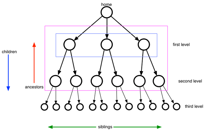
A tree nicely represents the structure of a website: the home page is the entry point, and from there the user drills down into the tree. There are, of course, plenty of cross-connections between nodes of the tree, but the basic structure is this hierarchical one. The terminology is obvious:
for any node, the arrows coming out of it lead to children
for any node, the arrows coming into it lead to its immediate ancestors
the ancestor of an ancestor is also an ancestor
nodes that share the same immediate ancestor are siblings
In the above example, there are three siblings in the first layer, and three pairs of siblings in the second level. The green arrow could be confusing; it is meant to show that sibling relationships are horizontal, while ancestor-child relationships are vertical.
Now let’s relate this to the navigation of a website. Most websites, as I noted above, show the first level of nodes in a top bar; those are shown by the purple rectangle. Some websites also show the second level nodes in popup menus attached to each node in the first level – that includes everything inside the magenta rectangle above. Remember, there may also be fourth and fifth levels as well.
RapidWeaver doesn’t permit you to set up either of these structures – neither purple nor magenta. Instead, here are the two navigation systems that you must choose between:
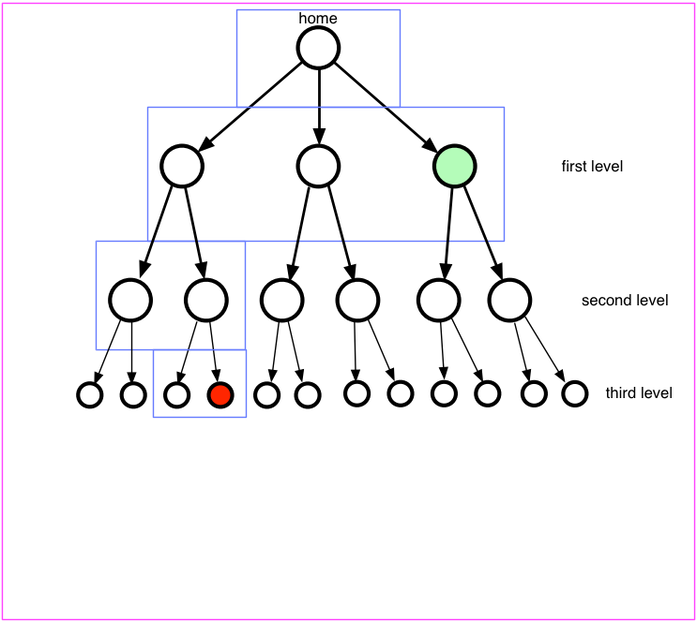
Your first choice is the blue set of rectangles: from the currently viewed page (highlighted in red), the user can use menus that will show all the siblings of that page, its ancestor, all the siblings of that ancestor, the next ancestor up, all the siblings of the next ancestor up, all the way back to home. In other words, you can jump from the red page to the light green page in a single step. The question is, why would you want to?
Your second choice is shown by the magenta rectangle: everything. From each and every page on the website, you can navigate by nested menus to any other page on the website. This is really powerful! Of course, it’s powerful in the same way that a telephone directory is powerful: you’ve got a ton of information in that menu structure, but do you really want all of that information thrown at you in a big pile like that?
Note further that neither of these two navigation systems supports the standard navigation systems used all over the web. This is a unique system. But it gets worse. In order to manage all that data, each and every page in the website must contain the addresses of all the other pages in the website, relative to its own location. With a big website, that means that a great deal of information. But here’s the real kicker: suppose that you add a page anywhere in the website. Since each and every page must contain the address of that new page, each and every page must be rewritten. In other words, adding a page causes the entire website to be recalculated. Even worse, each and every page in the website must be uploaded again – because it has been changed. In other words, adding a new page requires a complete re-setting of the entire website; this process consumes about 16 minutes in the of erasmatazz.com.
[Postscript June 15th, 2013: I have since figured out more about the system. They don’t actually put all that information on each web page; instead, they appear to rely on what programmers call a ‘pointer table’. However, they also do something really bad whose purpose I have never understood. When they load a website from disk, they build a huge table containing links from every page to every other page. Erasmatazz.com currently has about 870 pages; this means that roughly 750,000 such links must be created. Moreover, they appear to build it incrementally, assigning some sort of memory object to each such link. This means that the operating system goes nuts building the pointer table; the process consumes 26 seconds of pure CPU time on my four-core CPU running at 2.8 GHz. This offers NOTHING in the way of improved function. It just slows everything down.]
OK, so the whole thing is idiotic. So why don’t I explain it to the developers of RapidWeaver and suggest that they fix it? Here’s where the tale turns sad. I did in fact get onto their community forum and explained at great length, several times, what they were doing wrong and how it could be fixed. They didn’t want to hear it. I emphasize: they never contradicted my points – they just didn’t want to hear them. The members of the community were quite happy with RapidWeaver just the way it is and would brook no criticisms of their baby. They dismissed my complaints with the observation that I obviously didn’t understand how the program is meant to function. At no point did they ever directly address any of my specific complaints – they simply reiterated that I didn’t understand the operation of the program and was bringing unrealistic expectations.
That’s what I find so sad about the whole thing: software people get so well-adjusted to their situation that they come to assume that it is the right and proper way for things to be. Here’s a joke that Alan Kay told me many years ago about user interface design:
A guy goes into a tailor desiring a new suit. The tailor takes his measurements and tells him to come back in a week’s time. A week later, the customer shows up and tries on the new suit. He doesn’t like the fit at all. “Look at this right arm!” he complains. “It’s too long!”
“No, no, no” the tailor says, “you’re just wearing it wrong. Here, just hitch up your right shoulder like this. See? Now it fits perfectly!”
The customer grudgingly accepts the suggestion. “But what about this left leg? It’s obviously too short!”
“Perhaps, sir, you’re not acquainted with how one wears a fine suit like this. All you need to do is bend your right knee like this and that lowers your left left so as to render the length of the left pant leg absolutely perfect!”
The customer is still skeptical but the tailor reminds him that he, the tailor, is a professional and an expert in these things, while the customer obviously has little experience with fine tailoring. So the customer accepts the tailor’s recommendations, pays him, and hobbles out of the shop trying to maintain the proper body form for the suit.
Half a block down the street, a passerby stops him and asks, “Where did you get that suit?” He customer twists around uncomfortably and gestures in the approximate direction of the tailor’s shop. “Hot ziggedy!” the passerby exclaims. “I’m going to get a suit from him! If he can make a suit to fit a hunchback like you, he must be great!”
What’s so sad about this is that all these self-made hunchbacks are so disdainful of me for standing up straight and walking normally. From their point of view, I don’t know how to wear a fine suit. And they’ll continue this way forever, just like the people who kept using MS-DOS for years after Windows had come out, because they are certain that the good old way of doing things is better.
This is one of the major reasons why software is so lousy. I’m going to finish up this long essay now and upload it to the server. There goes another sixteen minutes...