
For some reason I have managed to get the HTML display code working properly; here’s a screenshot of a web page as interpreted by the Safari browser:
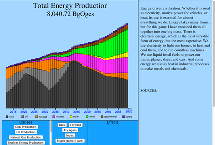
This display was achieved by means of some, er, nontraditional uses of HTML. Consider, for example, that multicolored bar chart. Each and every rectangle in it is an HTML iFrame. For readers who don’t know HTML, an iFrame is a window into another webpage. iFrames are usually quite large so that they can show most of the foreign web page. But these iFrames are teensy-weensy, and they don’t contain ANY webpages. I used the “nohref” selector to keep the iFrame empty, and then I set the background color to the desired value. Yes, it’s a gross violation of the design intent of the iFrame, and may not work on browsers that treat an iFrame in some form not quite like I expected. I tried it with both Firefox and Safari, and it works just fine with them; I’ll try some other browsers later. But the remarkable thing is that this page has over 500 iFrames! This is the worst-case; most pages have only 60 iFrames.
Another oddity is that I had to squeeze the display vertically. That’s because the iPad has a resolution of 1024h x 768v -- a standard size for most tablets. I designed for this size, but I failed to take into account the screen real estate eaten up iPad’s operating system and Safari’s toolbar. Together, they gobble up 77 pixels of vertical space, meaning that my actual limit to fit into the iPad is only 691 pixels. Yeowch!! I went to work and trimmed and trimmed, and here’s the result. The big trick lay in merging buttons based on a two-phase system. The “Try Again” button is originally labeled “Tallyho!” at the outset of the game, when the player is browsing the causal network and setting tax values. Once the player is ready, he presses the “Tallyho!” button and the simulation kicks in, running until the year 2070. At that point, I reason that the player has no need to see the browsing imagery, so I automatically replace the browsing-round imagery with the after-simulation history chart. That means that I don’t have to have two buttons to flip between those two displays. Yes, it’s a little less flexible, but I very much doubt that many users will feel the pinch.
The other trick was to use “Tallyho!” when you’re browsing and “Try Again” when you’ve finished the simulation. After all, who wants to try again before they’ve done anything? And who wants to run the simulation when they’ve just finished running it? The two conditions truly are mutually exclusive, so it’s OK to merge them into a single button.
These tricks make it possible for me to extend the text box all the way to the bottom of the window, which will be significant for those pages that contain a lot of explanatory text.
One last pat on my back: I’m rather pleased with myself for labeling the Quit button “Stupid Game! I Quit!” After all, that is pretty much the attitude that most people will have when the quit.