
Today’s problem concerns the impact of taxation on the system. My goal is to demonstrate that some taxation (especially carbon taxation) is desirable, but that too much taxation would be destructive to the economy. I’m aiming for about $50/ton as the ideal tax rate. But the system just now rewards more taxation with more points: my best score is with taxation at $1000/ton, which the system cannot exceed.
To fix this, I made two changes: first, I increased the impact of increased effective prices of energy on industrial production; I did this by squaring the price value in the denominator for industrial production. This didn’t accomplish enough, so my second approach was to greatly increase the point value of the various components of Quality of Life, such as economic growth, the availability of transportation, and so forth. This got me closer. So then I started trying out various scenarios with differing values of the carbon tax. Here’s a sketch graph of the result:
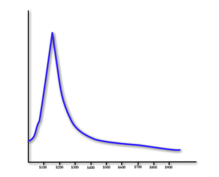
There’s a very narrow peak right at $150. I’m quite surprised it came out this way; it’s nice in that the peak is so high and so narrow. That implies to the student that there is one ideal value. There are of course many more adjustments required to make this thing proper. Perhaps I should aim for something with a more rounded peak, and somewhat lower in tax amount. I have to check and see how the other tax and subsidy options improve this. And I have to adjust the scale upwards: at this point, the peak value is still something like -1,300,000 points. That can be achieved by increasing the value of the positive components such as transportation.
But a new problem reared its head immediately. Get a load of this composite graph:
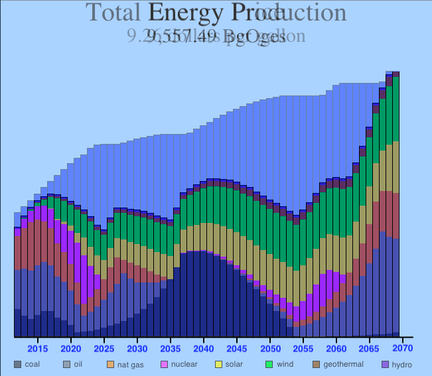
This overlays the multicolored Total Energy Production graph on top of the Energy Price graph, which is represented by the uppermost blue graph. (Be aware that the tax of $150/ton carbon was applied in ten steps of $15/ton each.) Look how the use of coal fell, then rapidly rose to a peak around 2040, then fell again. Oil is even crazier: it declines to zero in 2035, then starts up slowly around 2045, rising to a peak in 2067. Natural gas shows similar craziness. And nuclear is even crazier! What gives?
What’s especially perplexing about this graph is that the energy price peaked at only $9.26/gallon. I built the algorithms to be robust right up to $20/gallon. So I tried various tax levels; get a load of these three comparisons:
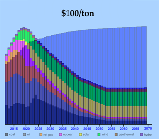
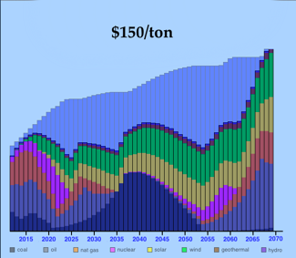
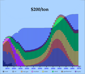
It appears that, with taxes low at $100/ton, the economy uses up its fossil fuels and must then turn with ever-increasing reliance upon renewables. With too-high taxes at $200/ton, the economy quickly ditches the carbon-releasing fossil fuels, quickly turns to renewables, but then, as the price of energy rises, returns to the fossil fuels. And the $150/ton point is the break-even between the two effects, where the economy rapidly oscillates from fossil fuels to renewables, then back, then forth.
Is this good? is this what I want to teach to students? Do I need to change some coefficients to improve it? If so, WHICH coefficients?
Later…
I figured out the reason for the oscillations: I restrict the growth of a nonrenewable source to 20% per year. Thus, when coal got driven down to nothing, it took a while to respond later when the price rose high enough to motivate renewed use of coal. Supply lagged price for some time (that’s the curve with positive second derivative), and when it finally caught up, the effect of consuming supply started grinding it back down again. When I permitted faster response to high prices, the problem disappeared – but now the ideal tax level is about $220/ton, which is unacceptably high.
I fear that I must increase the impact of rising energy prices on the economy.