9:00 AM
It’s been three whole days without a diary! The lack of a diary reflects not a lack of progress but rather a lack of interesting progress. For the most part, I’ve been grinding along, filling in text in the page definitions, fixing tiny problems in layouts and images, and other dull stuff. But a few interesting things have happened. I added a new index feature that permits the user to see a complete list of all the pages and jump directly to any of them. This can save a lot of time when you’re navigating through the webwork of causal relationships. I added a new subsidy for public transport.
The most time-consuming task has been the creation of the images to illustrate the factors. For example, I wanted an image for Northern Disease Deaths. I had a simple conception of that: the classic image of the doctors rushing a patient through the hospital corridors. We’ve all seen it a million times. I searched the net for three hours. Every time I thought I had found something, it turned out to be copyrighted. I am VERY careful about copyright issues. I search the source page for any reference to copyright or “all rights reserved” or the copyright symbol or anything else that might possibly indicate that the image is not free for the taking. If I find something that looks safe, I download it and then check the embedded information for anything indicating that it might not be free. If I discover the same image elsewhere, I check it there to make sure that the first place I got it from hadn’t pirated it. This is a slow and tedious process, made especially difficult by my pickiness. I want the perfect picture to make my point. I have learned that almost any site ending with “.com” is copyrighted in its entirety. Many sites with “.org” are also copyrighted. The two best sources are Wikimedia Commons and blog sites. I must still be cautious with the blog sites; I’m sure that some of them pirate their images with impunity.
After three hours of searching for the “rushing patient” image, I gave up and settled on an image of an ambulance with flashing red lights. I was displeased with it, but it was the best I could find.
Then a few hours later I realized that I had to make a big change. The causes and effects boxes are rather short and can only hold four buttons. I had been carefully juggling my web structure to live with this constraint. But then I came across something that was simply unavoidable. It needed to show nine buttons and there just wasn’t enough screen space to show them all. I had no choice: I had to replace the fixed-size button sets with scroll boxes. Most of the time they wouldn’t be needed, but sometimes there was no other way. So I altered the code to show scrollboxes. Here’s the most extreme case:
But with change in place, it turned out that I didn’t need Northern Disease Deaths any more; I could lump all forms of Northern Deaths into one big group. So I deleted the page and its image – which had taken three hours to find.
Another important factor to me was my desire to contrast the Northern lifestyle with the Southern lifestyle (Northern and Southern are the simplest terms to differentiate the rich countries from the poor countries, because it’s politically incorrect to call them “rich” and “poor”. I don’t know why that is so.) So I spent a lot of time working on contrasting imagery. Here are some of the pairings I came up with:

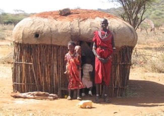
Quality of Northern Life Quality of Southern Life
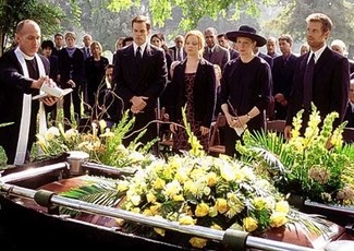
Northern Deaths Southern Deaths
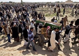
For the lower set, I had initially used an empty hospital bed to show how clean and discrete Northern deaths are, and a trio of bodies lying in the sand to show how ugly Southern deaths often are. But I decided that these images were just too disturbing, so I used these more emotionally distant images.
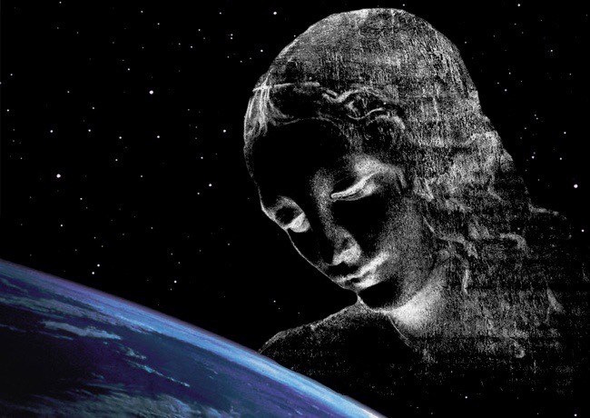
But last night I realized that I wanted to add a page for “Gaia”, reflecting the basic desire to live in a clean environment. The existing point structure is too heavily materialistic, focussing almost entirely on economics and human suffering caused by environmental insults. So I put this additional factor into the webwork, then set to work finding a good image to represent it. I spent hours trawling the web looking for the right image, and finally decided that no such image was available; I’d have to create it myself using parts taken from the Internet. Here’s the result of my efforts: