
It’s funny how habits can be ingrained so deeply that you never notice them. In this case, the habit in question is my parsimonious design; I always try too hard to shrink everything down to the minimum. This was appropriate back in the days when I had 1K of RAM to work with and an eight-bit processor running at 1 MHz. Nowadays, I don’t need to be so miserly with resources.
The particular item here is screen space. I have always hewed to the smallest screen in popular use; nowadays that’s 1024h x 768v, and on Microsoft machines, that’s really 1024h x 660v in practice. Last night it occurred to me: “Why am I catering to the lowest common denominator? This is not a commercial product; who cares about reaching the masses?” Further reflection underlined this thinking. You can find the latest screen sizes showing up on the Web here. A quickie summary:
As you can see, there’s a big break at 1366h x 768v; 78% of all browsers have something at least this big. Sadly, the 768 vertical pixels are still too short to meet my needs. So what size should I design for?
Here’s another consideration: the only people who will bother to look at Siboot are the first adapters, and these people always have top-notch displays. There’s something like ‘community karma’ here: the community often lauds designs that require massive resources, failing to take into account that a more egalitarian design cannot presume such resource. Since the community behaves in that fashion, I might as well take advantage of it and splurge on resource requirements. If the unwashed masses can’t play Siboot, that’s just too bad for them.
I did some further checking, looking at the monitors on sale at Amazon.com, and found that the five most popular monitors are all at least 1920h x 1080v in size. There are some 1600h x 900v monitors; they cost about $100, so these are definitely the cheapies. My guess is that the smaller screen sizes are on laptops. Screw the laptops.
Again I ask, what size should I design for? It would seem that 1366h x 768v is a safe bet, but I’m having problems fitting my requirements into that. My games always require the player to assess lots of information. In past times, I made all that information available with lots of menus and windows. Screw that; it slows down the game. Players seldom bother to look up information, so I need to put everything important in the main display. Here’s an attempt at a layout for 1200h x 800v:
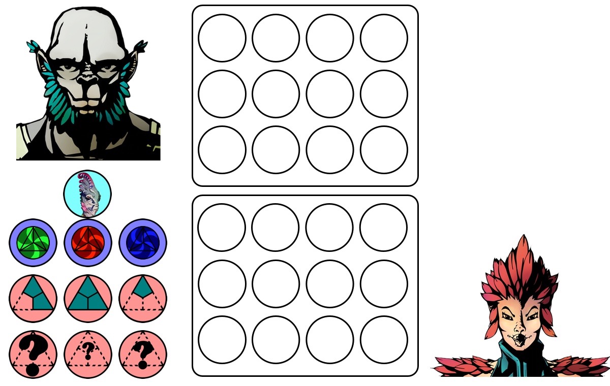
(This is only about 87% actual size because I specify that all my web pages be only 1000 px wide.)
Explanation: the face in the lower right is the player’s face; the face in the upper left is the person the interlocutor is talking to. They’re talking about the actor shown in the left middle. The icons in the lower left indicate the possessions of the actor they’re talking about; this is directly relevant to the conversation. The two sets of twelve circles represent speech bubbles. The largest sentence will just fit inside these bubbles, so I have to set aside this screen space for them. The section in the upper right is as yet unallocated, but I have some ideas about what I would like to put in it.
As you can see, this layout is squeezed for vertical space. If I really want to splurge, I could easily go to 1600h x 1000v. Here’s a screen layout for that size containing the same information as above:
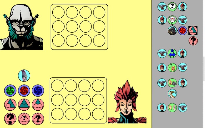
(This is only about 62% actual size because I specify that all my web pages be only 1000 px wide.)
This version sports the ‘historybook’ along the right edge; it’s the history of what the player has experienced. Even with 1600 horizontal pixels, I still couldn’t fit everything into the space, so I decided to shrink the historybook images somewhat; here’s how it looks at full size:
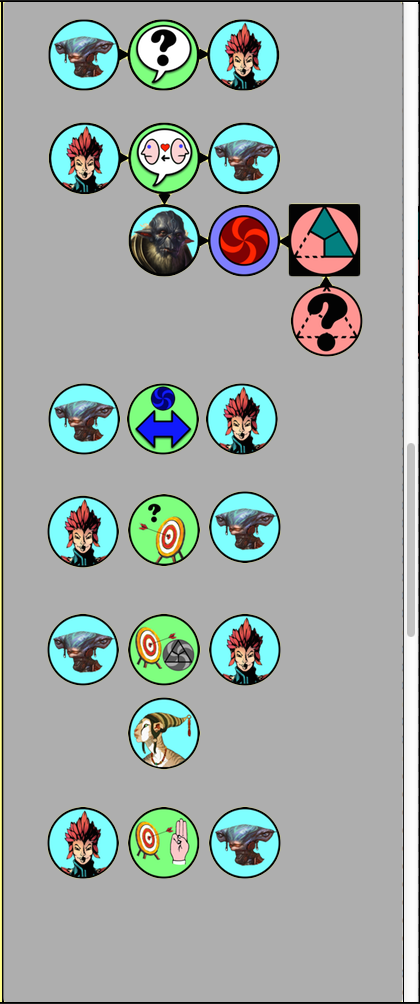
It’s still quite readable. This raises the question of whether my 96-pixel icons are too large. The icons in the historybook are only 72 pixels in diameter and they seem quite readable. Indeed, if I shrank all the icons to 80 pixels, then I would save 112 horizontal pixels in the display as a whole, and could easily afford to present the historybook at full size. Here’s what that would look like:
(This is only about 72% actual size)
This version is 1389h x 714v — quite compact compared to the others. I left the historybook icons on the right at their 72-pixel size; they should be as big as the 80-pixel icons on the left. There’s plenty of room for the larger size.
I think it’s time for me to mull this over.
