
August 21st, 2012
My attempt to fund Balance of the Planet by Kickstarter has gone down in flames, an abject failure. I learned a great deal in the process, and one of the most striking things for me was the continued obsession with eye candy that continues to dominate all thinking about games. This is an ancient dispute I have had with gamers; I wrote about it more than 20 years ago in articles for the Journal of Computer Game Design such as The Primacy of Interactivity, The Evolution of Graphics, The Invasion of the Expositorions, The Evolution of Taste, and most stridently in Ga-Ga Over Graphics. I revisit the topic only because it has become so deeply ingrained in the thinking of gamers that they don’t even notice their obsession.
My proposal for Balance of the Planet triggered an almost universal complaint that the design is graphically impoverished. That was easily the single most common criticism of the design; indeed, many of the comments about the matter took an almost incredulous tone: have you lost your mind, Chris? You can’t possibly expect anybody to pay attention to your software if it has such crappy graphics.
I just checked and the imagery in Balance of the Planet comprises 200 images requiring 20 MB of storage; while this is nothing to boast about, it is certainly a healthy chunk of imagery. I suspect that part of the objection is not so much to the quantity of the imagery as to its style. To show you what I mean, here is a compendium of the title imagery for some of the most popular games on Kickstarter as of August 21st, 2012:
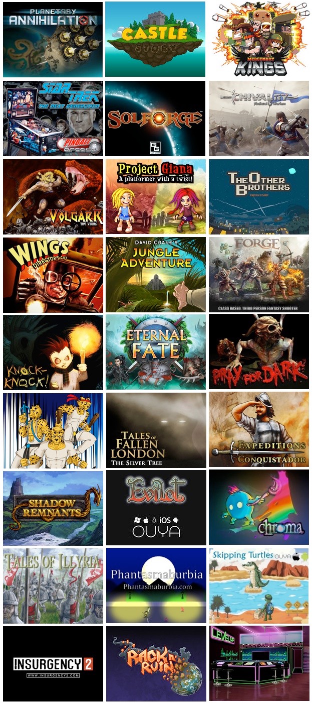
Now, I’m sure that a gamer will look at these images and see nothing of note; they all seem perfectly normal and proper. But I look at these images and I see mostly cartoons. I have nothing against cartoons per se; but I do find it disheartening that the games crowd cannot think of anything beyond cartoons. That, I think, is the underlying objection to the imagery in Balance of the Planet. Here, for example, is an image in Balance of the Planet that I’m sure many gamers will find inadequate:
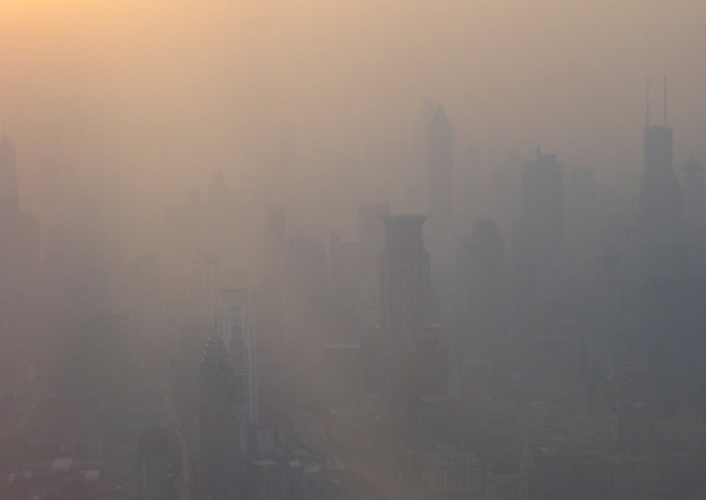
Look at it! It’s dull! It’s gray! It’s low-contrast, low-color, low-everything! This image is used to illustrate air pollution, and that’s the whole point of this image: that air pollution plunges cities into clouds of dingy brown smog. It’s perfect to make the intended point. The communicative purpose would be subverted by a bright, colorful and eye-tickling image; what is needed here should be alarmingly drab, dull, and brown.
This illustrates the fundamental difference between my design philosophy and that of most gamers as far as imagery goes: for gamers, imagery exists to please the eye, to tickle the fancy, to entertain with bright colors and strong lines. For me, imagery exists to communicate ideas. Indeed, this difference extends to the fundamental nature of game design. I see games as an art form that can communicate ideas. Gamers see it as an entertainment medium whose fun factor should not be compromised with snotty artistic ideas. Sam Goldwyn famously said about movies, “If you want to send a message, use Western Union.” He’d fit right into today’s gaming world.
I don’t make eye candy; I make mind cuisine.