
In a previous essay (“Whither This Poor Pilgrim“), I described the quandary I faced when I realized that the company behind my website platform (Sandvox) had gone out of business. Realizing that it was only a matter of time before Sandvox became obsolete, I resolved to find a new platform. After much research, I finally settled on WordPress. After all, 5 million websites can’t be wrong — right?
So I located an experienced WordPress developer to convert my website –all 1500+ pages– to WordPress format. It was a huge job and I paid her thousands of dollars for the work. It took her about two months. When she turned it over to me eleven days ago, I eagerly set to work learning how to make WordPress do its stuff.
What a pile of crap WordPress is! In all my years working with many different applications, I have never encountered such a badly designed monstrosity. In terms of user-friendliness, WordPress makes Microsoft Word look like MacWrite, and Adobe Photoshop look like MacPaint. (MacWrite and MacPaint were the first two applications for the Mac, released in January 1984.)
I suspected that I would have problems with WordPress when I got started, so I kept a log of problems I was experiencing, but I gave up on that log after just 48 hours — it was already absurdly long. I could list dozens of cosmically stupid things about WordPress, but I’ll mention just two here.
First: the magical, mystical “hidden user interface element”
Here we have a portion of the page showing broken links:

OK, so what? How can I fix this broken link? There’s no indication anywhere what I might be able to do. However, after much experimentation, I discovered the hidden secret: if you can get past the automatic poisoned arrows and the automatic rolling boulder, and hover your mouse in just the right place, the display suddenly changes to show the secret commands:

Now, this is not a pop-up component: it doesn’t conserve any screen space. It occupies space that was previously just white space. In other words, hiding it serves no useful purpose; its only effect is to make it impossible for beginners to know how to use WordPress. This is the very antithesis of user-friendliness: this is concentrated essence of user-hatred.
Of course, defenders of WordPress will rush to note that, once you know the trick, it’s not a problem. It makes the screen a bit less cluttered. Very well, if they think that eliminating clutter is a worthy idea, I propose this, the ultimate WordPress user interface:
Stare agape at this magnificently clean, uncluttered user interface: nothing but a pure snow-white expanse of eye-pleasing space. No messy words, buttons, menus, or any of that other dirt to clutter up the display. Everything is still there, of course; you just have to hover your mouse over it to make it appear. After all, since you already know the interface, you don’t need to have it shoved into your face, do you?
By the way, the “hidden user interface element” trick shows up in a number of places. When using WordPress, I advise that you systematically move your mouse over every pixel of the screen in a strategically designed grid search; I’ll just bet that somewhere on that screen is a pixel that, hovered over, will balance the Federal budget and bring world peace.
Second: the Mount Everest of menus
When you create a new page, you are allowed to set its parent page. You do this with an innocent-looking pop-up menu:

This looks simple enough, right? Just click on it, right? Well, if your website has over 1500 pages, as mine does, you get something like this:
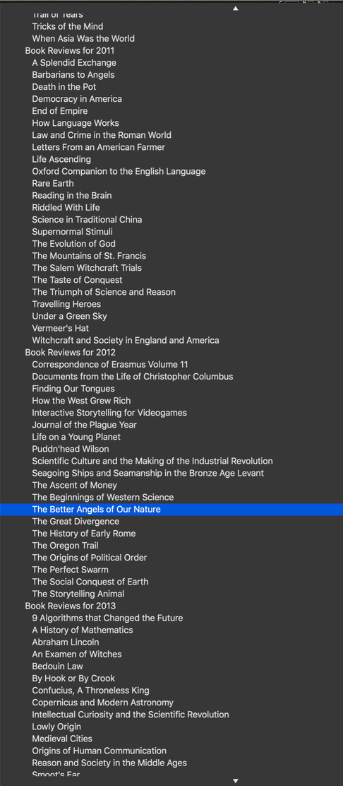
It can take a lot of scrolling to find the page you’re looking for. Now, organizing a long list of items in a tree structure is not a new problem; in fact, the solution has been lying around for decades. Behold the correct way to present such information:
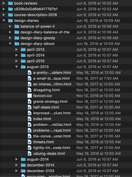
This is how it’s done in the Macintosh Finder, but Windows and Unix use exactly the same design. In fact, EVERYBODY uses this basic scheme for presenting information organized in a tree. Everybody except WordPress. Apparently the geniuses behind WordPress have never heard of “user interface design”.
This one failure renders WordPress unusable for me.
Third: the hidden forums
As I have said, there are a great many other outrages against good design in WordPress, but now I’ll skip to the coup de grace. “I’ll bet there’s an easy solution to this second problem” sez I. “I’ll just run over to their community forums and ask for help. I’m sure that somebody there has an answer.” sez I. So I go to the WordPress website, scout around, and eventually find the gateway to the forums. There are some introductory pages laying out the basic reminders we all know: no obscenity, no smut, no spam, be nice, etc. There are lots of different forums for different needs and interests. I browse around, looking at all the different warnings, advisories, and options. There’s only one problem: there aren’t any links to any forums. I start clicking on every link I can find, but I’m just going around in circles. THERE AREN’T ANY FORUMS!!!!! Perhaps this is another case of the “hidden user interface elements”.
That did it. I have never had problems locating the help forums for any other software application. But WordPress is its own closed community that does not tolerate beginners. If you don’t already know the answers, then you aren’t smart enough to ask any questions.
It looks as if I’m going to have to throw away my $3,750 investment in WordPress. That’s a lot of money to waste, but screwing around with WordPress is going to cost me even more in lost time. I’m not sure what I’ll do. Perhaps I should just revert to HTML, CSS, and direct FTP transfers. It would certainly be a hell of a lot easier than using WordPress.
Followup the next day:
I have learned a great deal since I first wrote this rant yesterday. I got some good feedback from Sasha Fenn, and Michael Frantz provided me with a link to the WordPress forums. I was able to get an account, log in, and post my question. The first person took umbrage at my statement that “I cannot believe that WordPress is so stupid that it can’t handle this. Would somebody please explain to me…”. He considered it rude, and so taunted me that, while the answer was obvious, he wouldn’t reveal it. A second fellow was more understanding and addressed my question as best it could be answered. Apparently there is no solution to the second problem I cite above, but there are some helpful plugins that display the hierarchical structure. I thanked him profusely and followed up on each of the URLs he cited, learning even more.
Then the forum moderator weighed in, declaring that my insulting language had led him to temporarily suspend my account and delete my link to my rant. That demonstrated to me that the WordPress community is a typical techie community where criticism, no matter how presented, is not tolerated. By itself, this alone would be enough to convince me to abandon WordPress.
But I reached a firm decision after some deep thought about the nature of information organization. I realized that my own conceptualization process is incompatible with the way WordPress structures information. WordPress uses a conceptualization process favored by weak minds; they say ‘potato’ and I say ‘Solanum tuberosum‘. Let’s call the whole thing off.
Here is the explanation of the differing conceptualizations.