
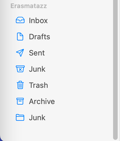
This is a dirty trick that user interface designers pull on users. The Macintosh Mail program has a good example. Here is the display of my mail account for this website:
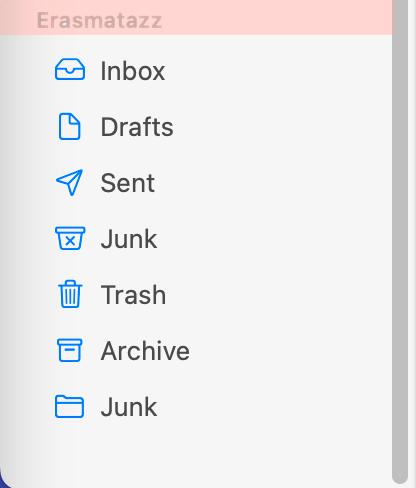
Now, suppose that I desire to add a special folder that holds all the emails that I have received from, say, the Boy Scouts of America. How do I go about doing this? There should be a button or menu item that permits this, but alas, a thorough search of all the menus reveals no such option. But one day, by pure accident, I happened to place my mouse in the pink region of the window:
When I do so, two new icons suddenly appear as if by magic:
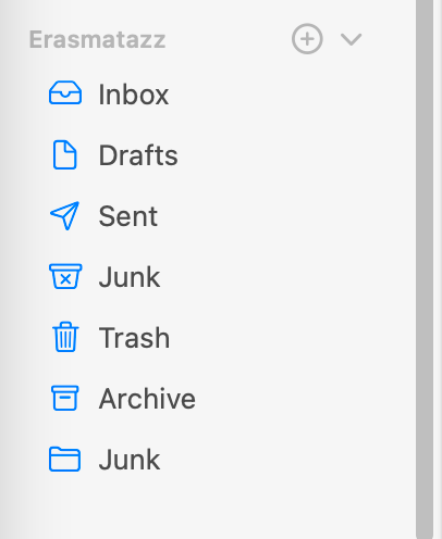
The little down arrow on the far right serves only to show or hide the items contained the “Erasmatazz” (these user interface designers are really enthusiastic about hiding things). When circle-plus icon is clicked on, this dialogue box appears:
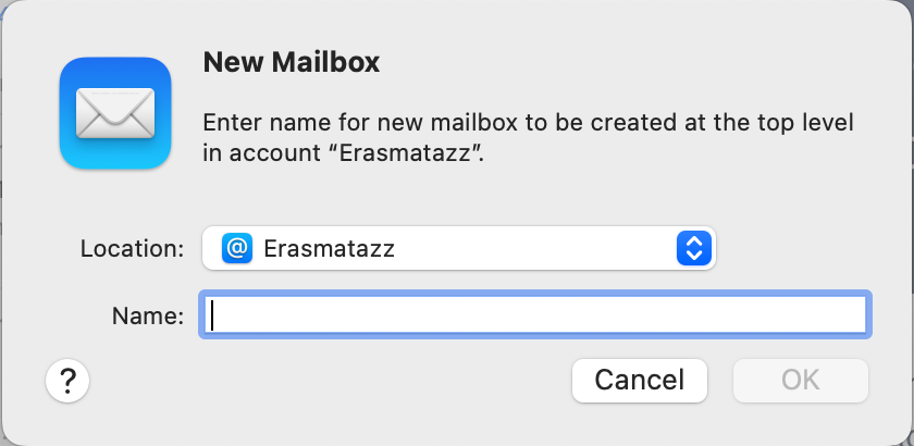
Ta-da! This is what I wanted! Hoorah! Trumpet fanfare!
But how could I have learned about that secret button in the first place? Let’s admit, the likelihood of accidentally stumbling onto is is low. In fact, I did discover it by accident, years after this ‘feature' was added.
But why?
The obvious question any reasonable person would ask is “Why would a software designer deliberately hide a component of the user interface?” We can blame graphic designers for this user interface outrage. I first experienced their dark influence many years ago, in response to one of my game designs.
First, some background. Software design has always suffered from a shortage of pixels. In the early days, we struggled under a range of deficiencies: not enough cycles (CPUs were too slow); not enough bytes (RAM was always in short supply); not enough hard storage (disk drives had only about 100K of storage); and not enough pixels (display capacity was at most 320h x 192v). Software design was a struggle against all these limitations. In particular, we had to be very good at squeezing the maximum amount of information onto those tiny screens.
Computers got faster and bigger; a modern computer is 3,000 times faster, has 8 times the word size, nearly 20,000 times as much RAM, and 10 million times as much nonvolatile storage. Yes, displays are bigger, but only a hundred or two hundred times as large (with much greater pixel depth). Moreover, a software designer must work inside a window that is usually smaller than what the monitor can support. Hence, we STILL sweat screen space, trying to stuff in as much useful information as we can fit. We don’t leave empty space unused.
Enter the graphics artists. They are the experts on visual layouts, and they know that white space is a necessary component of any graphic presentation. The acme of graphic design is the layout of advertisements in print media. Here’s an ad for Samsung that appeared in The Economist:

Gadzooks, look at all that wasted white space! Graphic designers will explain that the white space serves to draw the eye to the important information. The concept is straightforward: show only what is necessary. Don’t clutter up the space with lots of extraneous or distracting imagery.
When graphic designers are brought into a software design team, they apply this fundamental rule of graphic design and urge the software designers to “Simplify, simplify, simplify!” They want the window to show only what is absolutely essential for communicating the message. “White space is your friend!” they intone.
But the computer display is not the same as the magazine page; in fact, it is profoundly different because it’s interactive. On the printed page, the white space has a use: it directs the eye to the message. On a computer screen, the white space has no use. The software has a mountain of information that the user needs, and every pixel is valuable.
Here’s another example of this user interface disaster, this time involving Mac notifications:
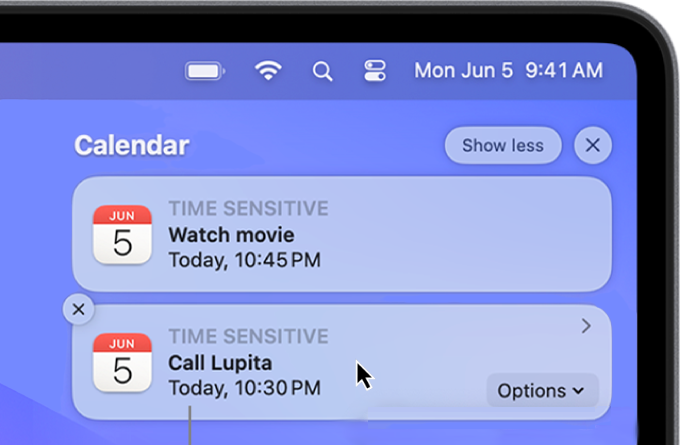
In this example, the upper notification is the normal display. The cursor is over the lower notification, so it presents the “Close this” X in the upper left, an “Options” button in the lower right, and a micro-arrow in the upper right that would presumably provide additional information. But none of these three controls are available unless you hover the cursor over the notification.
Note, moreover, that this “feature” doesn’t save a pixel of screen space. The displayed options don’t cover up anything. The sole purpose of hiding controls is to make the screen look “cleaner”. The consequence that users might not know what to do is the price that we pay for this graphic design fanaticism.
Sometimes the practice is defended with the claim that users will learn to hover their mouse over anything that they don’t recognize. “When in doubt, hover your mouse!” seems to be the idea. But how would somebody know WHERE to hover the mouse? The only rational response to this design philosophy is to hover the mouse over everything. Perhaps there’s a pixel hiding somewhere on the screen that, if clicked, will win you the $1 million Apple User Interface Lottery Prize. How do you know there ISN’T such a pixel?
Another defense sometimes offered is that, between social interaction and the Internet, users can easily learn these tricks. This might seem a flimsy excuse at first, but remember that software designers are mostly young people who are intensely social. Their personal networks are wide and they can easily find these answers. “Anybody can find out how it's done!” they declare. That may be true for young people, but there are a millions of people around the world who don’t visit technical forums every day and who don’t have a friend down the hall who can answer any question.
These are only the first two examples of the “secret button” crime that I have found. I invite readers to send me other examples they have found. In particular, I have no examples from Windows systems; surely they have share this fault with Mac.
November 27th
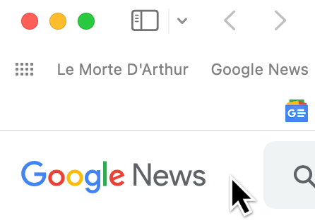
I found another example of a secret button in Apple’s Safari web browser. Here’s a screenshot of the upper left corner as it normally appears:
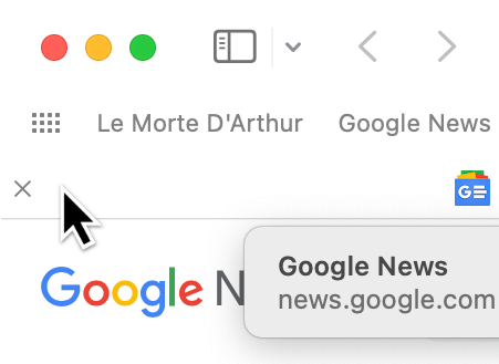
But if you move the cursor up to where the secret button is, it appears!
Perhaps Apple is the only perpetrator of the secret button crime. I shall be on the lookout for its non-appearance in other software. If you find any other secret buttons, please inform me so that I can include them here!