
October 17th, 2021
I have been a fan of Apple since 1984; I bought one of the first Macintosh’s. I don’t know how many Macs I’ve bought over the years: Mac, Fat Mac, Mac Plus, Mac IIx, and maybe six or eight more. I’ve used every operating system and all the basic Mac software for nearly forty years.
During this time, I’ve been a strong advocate for Macs. I found the Mac design philosophy much superior to the soulless dreck coming out of Microsoft. Mac software had verve and creative energy. It infected the community; the software for the Mac during the last century was more innovative, more playful, and always easier to use.
But something has gone wrong at Apple in the last few years. I don’t know what it is; all I know is that Apple is screwing up in ways unlike anything I have seen in forty years. This is not the Apple I know.
Part of the appeal of Mac software was its graphic design. Apple stuff LOOKED nice. But over the last few years, Apple has been on a crusade to de-prettify its graphics. I don’t understand what their purpose is. Perhaps they have decided that Apple software looks “too cute” and should instead communicate a serious, gray business-like image. Perhaps they have been consulting with lots of focus groups composed entirely of sourpusses. Whatever the reason, the changes are apparent. For example, here’s how they changed the standard beachball, used to indicate that a process is underway and the user must wait:

OK, that’s a little thing, but there’s more: look at how Macintosh window structures have changed. Here’s the structure for OS 9, dating about to about the year 2000:
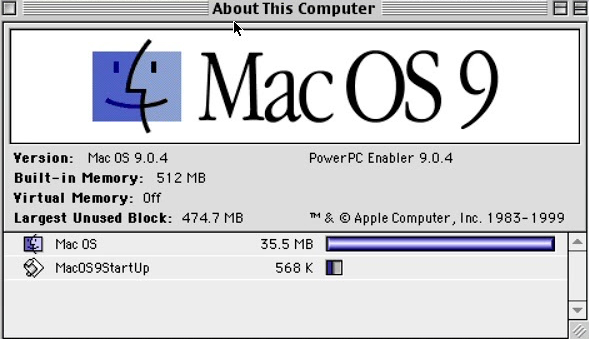
Note the simple “close this window” box in the upper left, and the boxes for shrinking and expanding it on the upper right. Here’s a Macintosh window a few years later:
Now the “close this window” square has transmogrified into a red dot, with the yellow and green dots representing minimizing the window and maximizing it. All in all, I think that this was an improvement, but look what they did with the latest version, OS 10.11:
The pretty 3-dimensional dots have been replaced by plain colored dots. They’re also smaller; I measured the old dots at 30 pixels in diameter, and the new ones have shrunk to 24 pixels. It’s not as if the window is desperately crowded for space; they just shrank the dots to make them harder to hit with your mouse. Thanks, Apple! 😖
Here’s what they did to the icon for Apple’s web browser, Safari:
This, I think, best illustrates Apple’s new “unpretty” graphics style. I’m sure that there’s some graphics guru who’ll insist that it’s better. I liked the visually pleasant style.
The Decline of User Interface Standards
Apple was the pioneer in good user interface design, and for years the best new concepts in user interface design always came from Apple, to be copied by Microsoft some time later. But now Apple follows Microsoft’s lead in torturing the user. Here’s just one example of Apple’s idiocy. Here’s a screenshot of a portion of Apple’s Mail program:
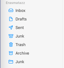
These are various places where I can put an email. Suppose that I want to add a special mailbox for all those delightful emails I get from those generous folks in Nigeria who want to give me money if only I will help them with the financial transaction. How do I add a new mailbox? There’s a menu item that allows you to add a new mailbox, but it doesn’t work. But here’s the real rub: there IS a way to add a new mailbox — but it’s hidden! Yes, friends, mere mortals are not allowed to use this feature. You must somehow know where it’s hidden BEFORE you try to use it. You accomplish this by pausing the mouse cursor over exactly the right spot, like so:
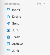
When you put the cursor over the top line (“Erasmatazz”), there suddenly appear two ghostly icons. The first allows you to create a new mailbox! Just click on it and you can enter the name of the mailbox. The second gray icon (the little down-pointing arrow) allows you to collapse this list of mailboxes into nothing, or return them to their standard arrangement.
This is a user interface outrage. Why hide control elements in unused space? It’s not as if this little trick saves any screen space. It’s only purpose is to make the screen look less busy. If Apple wants to REALLY clean up that messy mail window, this is what they need to do:

This cleans up that messy, cluttered Mail window. All those distracting textual elements have been removed to produce a truly clean interface. None of the functionality of the Mail program has been compromised — everything still acts just like it does in the old version; it’s just that the visual elements have been removed. If you know where everything is, you need merely pause your mouse over that element and it will appear for you to use. This user interface has the added benefit that it is almost as accessible to blind people as it is to sighted people. Apple marches forward!
We Control The Audio. We Control Everything!
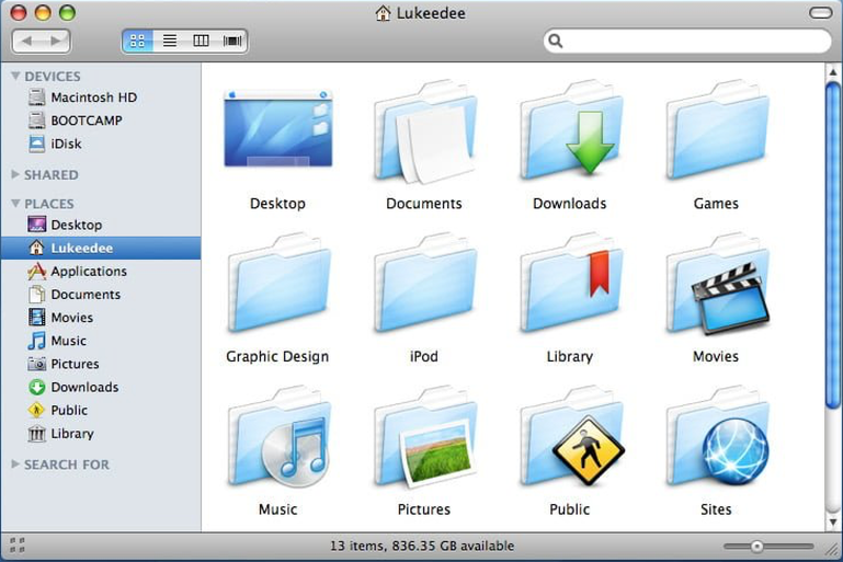
One of the nicest things about the Macintosh was the ease with which you could customize it to suit your own tastes. You could modify many of the elements of the user interface. This could be a lot of fun. For example, you could always substitute your own icons for any icon in the system. For example, you could changes the boring old folder icon into something indicative of its contents. So here’s what I did to a folder containing material for my lectures:
There have always been a zillion things you can customize on your Mac. However, the gods at Apple have now made it impossible to change any of the system sounds. This rubs my fur the wrong way in one place: when I take a screenshot, I used to hear the sound of a camera shutter. That was nice, and it made sense. But now, when I take a screenshot, I get a strange sound rather like a drop of water falling into a glass of water. Huh? There is absolutely NO connection between the sound and the action. It’s irritating to have the idiots at Apple change something that made sense into something that doesn’t make any sense. So I decided to change the sound effect back to its proper sound. After much research, I learned that Apple has now made it impossible to change any sound effects. Why? Perhaps it’s for some security reasons — maybe hackers can hack into your computer using the sound effects. I don’t know, but I’m irked by this apparently unnecessary restriction.
The Beachball Rampant
Apple has also decided that your four-processor Mac is simply too damn fast, and inserted new features into the latest operating system to freeze its operation at random times. You’ll be doing something and suddenly the beachball appears. “Why do I have to wait?” you’ll ask yourself. “What’s going on?” Well, peon, you’re not allowed to know what’s going on or why it’s happening. You must simply sit there and wait, and sometimes the waits have been long. Some people report delays of several minutes. I have experienced delays of up to twenty seconds. People have been complaining to Apple about this for nearly a year now. Apple has reduced the frequency of appearance of beachballs, but has not eliminated it.
I cannot imagine what Apple could have done to screw up this badly. There is simply no technical need for the operating system to go away for any perceptible length of time, much less for many seconds. This is a programming blunder of cosmic proportions, and Apple’s response seems to be “We’ll get around to that someday”. The Internet teems with angry questions about what to do about this problem, none of which seem to produce a useful answer. Right now, the community of Macintosh users is screwed and we can’t do anything about it.
This is why I no longer respect Apple.
Post scriptum: As if to confirm my estimate of Apple’s competence, I encountered this warning message when I attempted to downgrade from the current flawed operating system (Big Sur) to the previous, reliable one (Catalina):
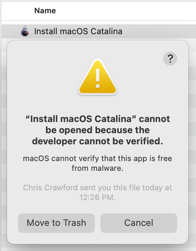
Yes, Apple cannot verify that it is a developer. Sheesh. 😬
Post post scriptum (December 17th, 2021)
Two more examples of Apple idiocy. The first is with iOS, the operating system for iPhone. There’s a simple application called “Notes” that allows the user to type short notes for later reference. It of course includes a backspace feature with a useful feature known as ‘acceleration’. When you first push down on the Backspace button, it deletes one character at a time rather slowly, but after a few seconds it starts deleting entire words rather than individual characters. This in itself is a minor error; it should have slowly increased the rate of deleting characters rather than shifting to deleting entire words. But the blunder lies elsewhere. I wanted to delete the entire contents of a note but keep the note itself — it’s my shopping list, which I regularly update as need arises. So I simply pressed and held down the backspace button. Here I discovered the blunder: once the software has deleted the entire contents of a note, it automatically jumps to the preceding note and begins deleting words from it at the same breakneck pace. This is idiocy! It deleted some critical information from an entirely different note, and I was unable to restore that information.
The next blunder is in the latest version of Mac OS, Monterey (OS 12.1). I have a backup drive that I use with Time Machine. That backup drive has a custom icon. The OS decides every few minutes to replace the custom icon with the standard folder icon; a fraction of a second later, it redraws the custom icon. The net result is a sudden blink that always distracts my eye, even now that I know it happens. It’s irritating to have to live with this stupid mistake. File icons do not need to be updated every few minutes.
