
I’ve been a Mac guy from the very beginning. I bought the original 128K Mac and a $10,000 Lisa to write code for it. I have continued using Macs ever since. I’ve owned a couple of Windows machines for various reasons, and I am unwilling to learn the mass of detail required to successfully operate a Windows machine.
However, I want to express my disappointment with the decline of the standards of user-friendliness in Mac software. Back in the twentieth century (oh, so long ago!), we used terms like “user friendliness” and “intuitive user interfaces”. Those concepts have been abandoned. The Mac reeks with a huge array of hidden verbs. A good rule of the Mac user interface is, “When in doubt, right-click on everything.” You’d be amazed at the discoveries you’ll make.
We’ve also seen a shrinking of user interface elements. Back in the good old days, when men were men and user interfaces made sense, every active user interface element was plain to see. Nowadays everything has been shrunk down to teensy-weensy little sub-icons. Here’s a screen shot I just took of my Firefox window:
![]()
Now, can you figure out what these sub-icons mean? Here’s my interpretation, from left to right:
ellipsis: must be something more
shielded chevron: something below?
star: who knows?
books on a bookshelf: a library?
thingamajig: who knows?
person: somebody
railroad tracks: who knows?
three bars: who knows?
Fortunately, these icons have little pop-up explanations:
ellipsis: page actions
shielded chevron: save to pocket
star: bookmark this page
books on a bookshelf: view history, saved bookmarks, and more.
thingamajig: show sidebars
person: Firefox account
railroad tracks: Facebook container
three bars: open menu
Now, these sub-icons do not in any manner suggest their true meaning. They might as well be hieroglyphs:
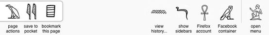
Seriously, does this make any less sense than the version above?
The reason for all these problems is galloping featuritis. If Brand X comes up with a trilobic framscolator, then Brand Y has to have a trilobic framscrolator, too. It doesn’t matter that nobody knows what a trilobic framscolator is, or what it does.
At a deeper level, the problem is the verb count. Crawford’s First Law of Software Design is:
Throughout the design process, you must repeatedly ask, “What does the user DO? What are the verbs?”
Way back in Stone Age times when we used command line interfaces, the verb count had to be kept low — perhaps a couple of dozen verbs — because nobody could memorize all those contractions. The rise of the GUI made larger verb counts possible, but it didn’t permit infinite verb counts. We’ve come up with a million schemes for expanding the verb counts: nested menus, nested dialog boxes, pop-up menus, tabs, and so on. My experience has been that you start losing the user when you get above about a hundred verbs. The early GUI applications stayed well below that ceiling, but Microsoft never met a verb it didn’t like, and its verb counts quickly rose to several hundred. Apple maintained some discipline, but it couldn’t resist the seductive allure of featuritis, and steadily Macintosh verb counts rose. Nowadays most applications have verb counts of several hundred.
The problem becomes, how do you squeeze all those verbs into a window? At first we hid them behind mouse clicks, as you have with regular menus. Then we started adding right-click menus. Then tiny sub-icons. But the vilest trick of all is the hidden verb. It doesn’t show up until you hover the mouse over it. If you don’t know that it’s there, you’ll NEVER know about it. So nowadays we’re reduced to randomly sliding our cursors over the window as if the user interface were an Easter Egg hunt. I’ll bet that somewhere in the FireFox user interface, there’s a secret verb that, when clicked on, gives you access to all the FireFox internal emails. It’s on a single tiny pixel in a place you’d never expect. Can anybody gainsay me?