
For the last four days now I have been struggling with the equations for the supply of energy. I had a pretty good system in place, but it had some minor weaknesses that I found unacceptable, so I decided to come up with something better. I ended up making matters much worse. The fundamental problem is that there is no single equation that adequately addresses all energy forms. I had broken them up into two types: renewable and nonrenewable. I then wrote a different equation for each type, differentiating two similar forms (such as coal versus oil) by two coefficients. For example, for nonrenewable forms, the first coefficient represented the maximum amount of economically recoverable reserves, and the second coefficient represented the amount that had already been consumed. I came up with a simple equation expressing the fact that, as a resource approaches exhaustion, its supply as a function of price falls.
The problem here is that the most resources follow an “S-curve” that shows rapid initial increase, a linear middle, and then asymptotically approaches a maximum. This is true for both renewable and non-renewable resources – the renewable ones reach an upper limit based on capacity. For example, the amount of solar energy we can collect with solar cells is limited by the fact that many locations are unsuitable for installation of solar PV arrays.
I have gone through all sorts of equations, and it seems that there is no single equation that works over the range of energy sources. After four days of bashing my head against the wall, I have decided on two possible strategies, both desperation measures. They both abandon my specification that every factor in the simulation be user-controllable via adjustment of coefficients to linear equations. That’s a disappointment, but I am convinced that no single linear equation can address the problem.
The first possible strategy is to go to some complicated equation with three or even four controlling coefficients. Back on September 17th I considered using a sigmoid function, but rejected the option on the grounds that the simulation would run for only 30 years. I have since doubled the time extent of the game; now it runs for 60 years, all the way to 2070. This doubling of the time extent makes the sigmoid function more appropriate, and therefore I am reconsidering applying it. This is what I had back on September 17th:
Supply of resource(inflection price) = Smax / (1 + e**-((PS*[inflection price])-offset) = Smax / 2
==> e**-((PS*[inflection price])-offset) = 1
==> PS*[inflection price] = offset
Supply of resource[$30 billion]= Smax / (1 + e**-((PS*[$30 billion])-offset)
at which point I went off in the wrong direction. There are three variables in these two formulae: PS, the price sensitivity of the resource, which I don’t know, the inflection price (the price of the resource at its inflection point) and offset, a measure of how close we are to peak production. I have two equations in two unknowns, so I should be able to solve the system. When I was in college, this would have been trivial to do, but it’s been forty years, so let’s see if I can still pull this off. Substituting the upper equation into the lower one gives:
Supply of resource[$30 billion]= Smax / (1 + e**-(PS*$30 billion-offset)
==> Supply of resource[$30 billion]* (1 + e**-(PS*$30 billion-offset) = Smax
==> 1 + e**-(PS*$30 billion-offset) = Smax / Supply of resource($30 billion)
==> e**-(PS*$30 billion-offset) = Smax / Supply of resource[$30 billion]- 1
==> -PS*$30 billion-offset = ln(Smax / Supply of resource[$30 billion]- 1)
==> offset - PS*$30 billion = ln(Smax / Supply of resource[$30 billion]- 1)
==> offset - PS*$30 billion = ln(Smax / Supply of resource[$30 billion]- 1)
I reach a dead end here: I have one equation with two variables, offset and PS (price sensitivity). I racked my brains trying to come up with a way to relate one to the other, but failed. So it looks as if this approach won’t work.
The other strategy is to do it empirically. I found a paper making predictions of supply and demand for different energy resources for the 21st century. Here’s a figure taken from that paper:
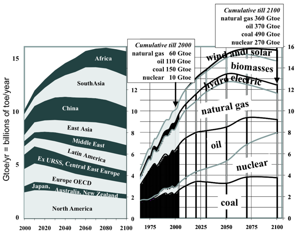
The energy resources in this diagram are piled on top of each other; I separated them to get this graph:
I don’t buy some aspects of this graph. In the first place, it’s entirely too optimistic about nuclear. The curve he shows represents what would happen in a purely rational world. However, humanity is not entirely rational and the unwarranted fear of nuclear power will suppress the growth of utilization of this resource. I also find his projections for wind and solar to be far too pessimistic; I believe that both of these resources will grow much more steeply than he indicates. Furthermore, I completely reject his belief that biomass will play an important role in the energy mix of the future. Old-style biomass (such as corn-based ethanol) was a bad idea to start with and will eventually go away, although ethanol from sugar cane does have a role to play. The real impact of biomass will come after we develop genetically modified algae that efficiently convert sunlight into fuel; but that’s not yet a proven technology and energy resources take decades to develop. Let’s not forget that the first solar photovoltaic and wind turbines were running 40 years ago, and are only now coming into their own.
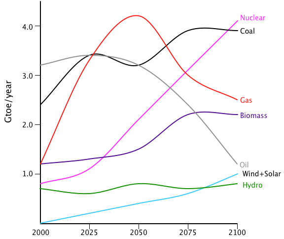
Here’s how I modified Beretta’s graph to reflect my own opinions:
I still have some reservations about this graph. The oil curve looks about right to me; it shows peak oil at 2025. Some people claim that peak oil is happening right now, while others maintain that the oil industry keeps coming up with new sources, such as tar sands and oil shale. All in all, I feel that this oil curve looks like the best overall assessment. The coal curve is depressing, but we have to admit that coal is hugely abundant and just too damned cheap. Without a carbon tax, coal will remain a major source of energy. (By the way, this graph represents what is called the “business as usual” scenario: how we think things will develop if no substantial changes in government policies are made.)
The natural gas curve also seems pretty solid to me. For a long time we thought that gas was going to peak fairly soon, but the new fracking technologies are opening up huge reserves of gas, so peak production will be later and higher than previously estimated. However, because gas is such a flexible fuel, I’m sure that we’ll burn it up pretty quickly.
The nuclear energy curve is much more problematic, because it depends on two wildly unpredictable yet opposed factors: the popular fear of all things radioactive and the desperate need for a baseload electrical source with no carbon emissions. Nobody knows how these will develop. The accident at Fukushima depressed the curve quite a bit; a long period with no accidents will raise it; another accident will depress it. Ten years from now, Fukushima may have turned out to have had no significant health effects (the most likely scenario, in my opinion). But what will the public perception be? Thirty years after the Three Mile Island accident, we’ve figured out that it had no significant effects on the public, but TMI still seems to loom large in the public perception of nuclear power. The curve for nuclear is a hunch, nothing more.
Hydro and geothermal are pretty easy; these two technologies are now mature and will surely grow as the demand for energy rises, but I don’t think that there’s anything surprising in their future. Most of the growth will be in developing nations. For example, the hydroelectric potential of the Himalayas has barely been tapped; with rapidly growing demand for electricity in China and India, I think we’ll see a lot more dams being built there.
Lastly come solar and wind. These also are wild cards. I’m fairly optimistic about them, but I don’t share the starry-eyed opinions of my greener friends. I’m pretty sure that wind will grow faster at first, because it’s a better-developed technology, but I fear that it will start topping out as the best sites are fully utilized. By the end of this century, I think we’ll be tapping into sites that don’t have such strong wind energy; that should depress the growth rate.
My differences with greens are even greater for solar PV; this is still an immature technology. It has been overhyped for 50 years now, with advocates claiming that the day of clean, free, abundant solar electricity are just around the corner. Instead, the growth rate has been slowly accelerating from next to nothing to what is now a goodly pace. I think we’ll continue to see rapid expansion of solar PV, but I just don’t believe that it will replace other energy forms in the 21st century -- not unless there’s a change in government policies.
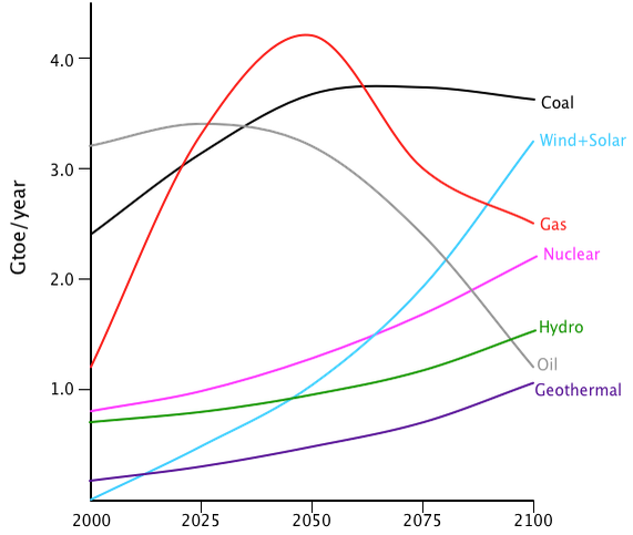
Here’s the way I would prefer to see things develop with a rational set of policies:
As you can see, this graph is very optimistic about nuclear, solar, and wind; it bumps up hydro and geothermal somewhat; and it’s ferociously anti-coal.
These graphs provide me with a data-intensive approach to setting the supply equations. Instead of figuring out the perfect theoretical curves, I instead just set up some tables based on this data. Of course, these graphs show supply versus time; what I need is supply versus price. This in turn requires me to come up with a price scenario under the business as usual case. Once again, we’re in Wild Hunch City. Here’s the history of oil prices over the last century:
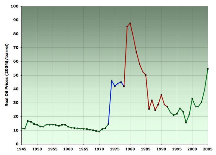
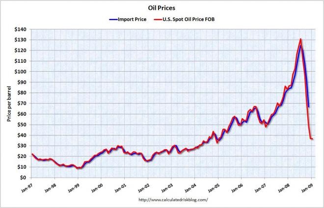
The two big spikes were due solely to political events: the OPEC embargo after the 1973 Arab-Israeli War, and the Iranian revolution. If we just cut those spikes out of the picture, then we get a curve showing a slow decline in prices from 1945 until 1970, with an accelerating upwards curve afterwards. The steep climb after 2002 does not reflect political events; it reflects the rise of China and the rest of the developing world. As their economies have grown, their demand for resources, especially oil, has exploded, putting intense upward pressure on prices. That steep price rise continued after 2005, reversing in the financial collapse of 2008, but quickly resuming its upward march in 2010.
So how do I extrapolate this all the way to 2100? It’s a hunch, but let’s start with a linear rise extrapolating from Jan 99 through Jan 09: during ten years the price increased from $10/bbl to $80/bbl, giving $7/bbl increase per year. That puts the price in 2100 at about $700/bbl! I find that number too high to believe, because high energy prices provide negative feedback to economic growth. Moreover, oil isn’t the only energy source; other sources kick in at higher prices, suppressing price growth. I therefore am going to make a wild guess: and increase of $3/bbl per year, which puts the price in 2100 at roughly $350/bbl. That’s about 4.5 times the current price. OK, that’s what I’ll go with. I have shifted to a more recognizable price metric for energy: dollars per gallon of gasoline equivalent. Right now that value is $4 per gallon of gasoline equivalent; I’ll put the 2100 price at $20/ggoe.
So now all I have to do is superimpose the price as a function of time over the graph of production as a function of time to get supply as a function of price. That’s a lot of busywork, but it’s usable.
To work.
Later: I just found this graph of predictions for oil production from the IPCC:
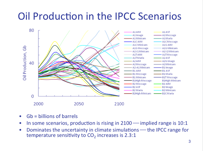
As you can see, there is some degree of disagreement on this question.