January 12th
Today’s problem arises from the programming. Normally programming issues are unworthy of design essays, but this one has me a bit befuddled — another frightening indication of impending senility.
The task involves the operation of the “Next Encounter” window, which opens when the user clicks on the “Next Encounter” button for a Reaction. That window will look something like this:

Six functions are required, all of which have already been handled for other parts of the program.
1-2: Each of the two popup menus must permit the user to select one of the six menu items.
3. The slider must permit modification of the number.
4. The list of Encounters must permit selection of a single encounter and then present the algorithm for it on the right.
5. The “-“ button must delete the selected encounter
6. The “+” button must bring up a new window listing all available encounters for selection and inclusion.
[Later]
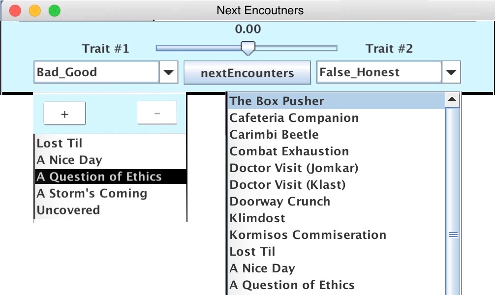
This is getting more difficult. Here’s my latest screen layout:
Pixelmator Pro tells me that it’s about 1100 px wide by 900 px hight. Yet the onscreen representation of it is 650 px wide by 538 px high. So what is the correct size? After rooting through the code, I conclude that the lower value is correct. So now I have to redesign this stupid layout. At least I have enough screen real estate to work with. So here’s another attempt:

This layout still suffers from a problem of ambiguity: note that there are two completely different Encounters selected: “The Box Pusher” and “A Question of Ethics”. This could create some confusion on the part of the user. One way to reduce that conclusion would be to hide the top panel until the user selects one of the Encounters in the left box. When the window first opens, there is no selection in either list. The right list should only be active AFTER the + button has been hit. Simply double-clicking on an item on the right places it into the list on the left.
Here’s another way to do it: Initially, nothing is selected in either list. Clicking on an entry in the right list enables the + button for the first time. If the user clicks on the plus button, then the entry on the right is entered on the left. The plus button is immediately disabled. If the left list is full (five entries), then the plus button will not be enabled.
If the left list has one or more entries, then selecting one item in the left list will enable the - button.
Sounds like a plan.
