January 9th
I had a horrible realization while in the shower this morning: I must include inclination equations in the system. I must completely abandon the system in which Encounters connect to each other randomly, as constrained by the Prerequisites and Disqualifiers. This changes everything, because I must now include some kind of scripting. Scripting is too complicated for beginners to learn. However, I can apply the same system used in deciding character responses. Here’s the current editing window:
It is squeezed down to fit onto this page. The solution is in the blue region on the right. These are inclination pseudo-scripts for the reacting character. I need merely apply the same system to the arrows connecting Encounters.
But there’s another nasty problem: the options apply to each reaction independently. I would have to have a box like the Prerequisites box permitting the author to select any other Encounter, and apply an inclination pseudo-script to it. I would need one such box for every reaction. There’s simply not enough screen space.
Yes, yes, I know, I could just pop up a new window containing the information — but I hate the idea of giving up a single-window presentation. I’ll try to redesign the window to reflect these changes:
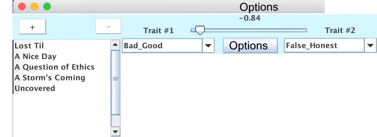
As you can see, it just doesn’t work. Each of those Encounters listed in the orphaned box (“Lost Til”, etc) must have its own pseudo-script just like the one above. It just won’t fit. Therefore, I must resort to popup windows. Should the popup window hold an entire reaction or just one option? The best arrangement, I think, would look like this:
Clicking on the Options button would open this popup window:

This looks like hell. It stinks. I hate wasting pixels!!! But it looks like the best approach. I can probably cut off much of the lower part — who’s going to include more than five options per reaction? Perhaps I should nail it down to a fixed number, just as with Reactions.
I don’t know. I’ll mull this.
