First results!
I have completed the two biggest steps in the entire analysis: the digitization of the tapes and the identification of Leonids in the images. There are a total of 26,793 Leonids in the sample -- a stupendously large collection of meteors, by far the largest dataset of meteors ever compiled. This collection is so big that it permits the application of statistical methods to look for traits that would otherwise be quite impossible to detect. Over the next few weeks I shall be posting diary entries discussing particular analyses. I begin with the first and most important of these: the rate curve. This shows the total activity over the course of four hours centered on the peak. But first, I must explain exactly what this graph shows. I use the “logical mean” of the number of Leonids per minute. This is the average of the number of Leonids per minute as reported by each camera that was actually recording data during that minute. I couldn’t just add up all the Leonids recorded by all six cameras and divided by six, because there were moments when one or more of the cameras were not active. So these numbers represent the average activity for all the active cameras, not all the cameras.
Note how sharply the activity rose to a sharp peak and how sharply it fell. Note also the time of peak activity as indicated on this graph: 1:57 AM. This is significant because earlier analyses had found the peak between 2:04 and 2:06. Pushing the peak 8 minutes forward has a small effect on the calculations of the precise orbit of the stream that caused this outburst. Note further that the curve appears to be close to symmetric. There is an asymmetry at around 60 minutes and 180 minutes: the early curve shows a higher second derivative than the later curve. Although the difference certainly looks statistically significant, I’m not sure that we can assign any scientific significance to it. The mode is at 1:58:20, and its closeness to the peak suggests a high degree of symmetry. 90% of the Leonids are contained within the period 12:48 to 3:06, which is 2 hours and 18 minutes long and centered on, guess what, 1:57 AM -- exactly where it should be if the curve is symmetric. 50% of the Leonids are contained within the period from 1:36 to 2:21, which is 45 minutes long and centered on 1:58 -- another good indicator of symmetry. All in all, I think it safe to say that this curve is highly symmetric.
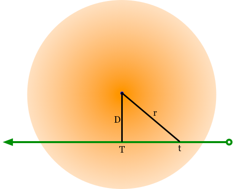
The reason for the symmetry comes from the structure of the stream that earth intersected. Its cross-sectional density of particles looks something like this, with possible track of the earth through the stream:

Now, let’s assume that the particle density falls of linearly as a function of distance from the center:
particle density(r) = Peak particle density/r
where r is the distance from the center.
Then the particle density that the earth would encounter would be:
earth particle density = Peak particle density / (sqrt(D**2 + (earth’s velocity * t - T)**2)
where D is the distance of closest approach and T is the time of closest approach. Here’s a graph of one such curve superimposed over the data:
You will observe that the fit isn’t good. So all I changed the parameters D and Peak Particle Density to get a better fit. That was still off, so I tried a 1/r**2 particle density function, but that didn’t work, either. So then I tried an exponential function for the particle density:
particle density(distance from center) = Peak particle density * e**(-distance from center)
which in turn yielded this equation for the particle density on earth:
earth particle density(t) = Peak particle density * e**(-sqrt(D**2+(earth’s velocity * time - T)**2)
This produced a fit similar to that above: too wide in the center and too narrow at the flanks. This function produced a fit similar to the above graph. Obviously, there is a problem in my conceptualization of the problem. But then a serendipitous accident graced me: I entered a bad equation and it produced an excellent fit. I then made some improvements on the equation and did a least squares fit, coming up with this final equation:
earth particle density(t) = 89 * e**(-absolute value(time-T)/33)
Here’s the fit it yields:
Pretty good, eh? Now let me explain the details: the first coefficient, 89, is simply the peak value of the local particle density. The value 33 represents the ratio of the velocity of the earth to the diameter of the stream. It says that it took the earth 33 minutes to move from the peak of activity to a point where the activity is 37% of the peak -- it’s a measure of the half-width of the stream. Implicit in this graph is the assumption that the earth plowed through the exact center of the stream, as well as the assumption that the stream has a circular cross-section. Neither assumption is reliable. What’s striking is that such a simple equation -- one that has no obvious connection to actual geometry of the situation -- generates such a close fit to the final results.
