Light Curves, Part 1
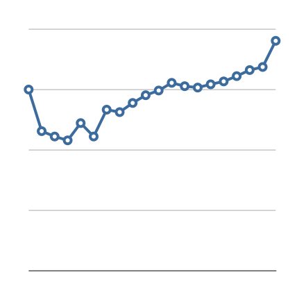
Let’s talk about the light curve for a Leonid. When it first enters the atmosphere, it starts to glow dimly, brightening as it plunges deeper. But it is so small that it “burns away” quickly, and it grows dimmer. Thus, the typical Leonid will brighten, then dim, with a light curve looking something like this:
Figure 1: a typical light curve
This graph is not hypothetical; it represents actual data. In this case, it represents the average values for every Leonid in my dataset that was 10 flares in length. In other words, my program selected out all the Leonids that were 10 flares long, then figured the average absolute luminance of all the first flares -- that’s the value for the first point in the graph above. Then it figured the average absolute luminance for all of the second flares -- that’s the second point in the graph. And so on for all ten flares in the ten-flare-long Leonids.
But why confine it to just the Leonids that were ten flares long? Why not look at Leonids of other lengths? I did that, and here are a few of the results:

Figure 2: light curve, five-flare-long Leonids
Figure 3: 15-flare-long Leonids
Figure 4: 20-flare-long Leonids
You might note some interesting changes in these graphs, so here is a composite of all the graphs for lengths from 5 flares to 24 flares:
Figure 5: Composite light curves of all lengths
There are some interesting trends in these light curves. The first is that the peak value shifts towards the right as Leonids get longer and longer. The position of this peak value relative to the entire length of the Leonid is called “f”. For example, you’ll note that the yellow curve representing Leonids that are six flares long (it’s in the front) shows a simple hump shape with the peak at the fourth flare, yielding an f-value of 0.6. By contrast, the very last curve, a pale yellow one representing Leonids of length 24 flares, has its peak at the 21st flare, yielding an f-value of 0.91. I used a more careful calculation to determine the f-value for Leonids of different lengths and this is the graph of the results:

Figure 6: f-value versus Leonid length
That’s a rather nice-looking curve, isn’t it? It says that longer Leonids have higher f-values. Here’s another interesting curve: the peak absolute luminance versus Leonid length:
Figure 7: Peak absolute luminance versus Leonid length
This shows that longer Leonids have a higher peak luminance. This makes perfect sense: a Leonid that lasts longer should be bigger, and therefore will have a higher peak absolute luminance. However, there’s more information buried in this graph. The most significant item is the turn-down at the high end. If bigger Leonids last longer and are brighter, then we’d expect the end of the graph to simply continue upward. Because these last data points are derived from fewer Leonids than the others, we’d expect more scatter in the results, but we would not expect to see the peak and downturn that are evident. The data suggests that there are two mechanisms controlling the maximum brightness of Leonids. The primary one results in the upward curve that comprises the bulk of this graph. But there’s a second factor at work that produces the turndown at the right end of the graph. I’ll address that second factor in the next analysis.
